 Nostalgia Cuisine, a coffee table book that i had worked upon. This book has also won an international award in the best cuisine book category.
Friday, December 25, 2009
coFfee tAble bOoK
 Nostalgia Cuisine, a coffee table book that i had worked upon. This book has also won an international award in the best cuisine book category.
Wednesday, December 23, 2009
eEe-maiLerS

This is an emailer wishing a Cement Manufaturing client on a famous Hindu Festival, Vijadasami & Ayudha Pooja.
 This is an emailer wishing a Cement Manufaturing client on the famous Festival of lights, Diwali.


 These are e-mailers that were designed and sent to clients on the respective occassions, for a radio station client.
 This is an emailer wishing a Cement Manufaturing client on the famous Festival of lights, Diwali.

 These are e-mailers that were designed and sent to clients on the respective occassions, for a radio station client.
 tHe LoGo

nAmE iT...

This brand identity was suggested for an organisation that is into brand consultancy and business solutions. So the fonts were carefully chosen to suit the name, as they are airy and the whole business buzz that runs like a hand fan represented visually.
 This logo was created for a radio station client, who is also into CSR and so to promote a road safety campaign this unit was created, this is not the final, the final had a signal drawn instead of the car, but i kinda like it for the thought behind this is that a child's note to its dear one who is driving out on roads. Why the child? because a child is the most sensitive part of the family, who awaits the comeback of its parent or a loved one. So anybody would get touched with this thought.
 This logo was created for a radio station client, who is also into CSR and so to promote a road safety campaign this unit was created, this is not the final, the final had a signal drawn instead of the car, but i kinda like it for the thought behind this is that a child's note to its dear one who is driving out on roads. Why the child? because a child is the most sensitive part of the family, who awaits the comeback of its parent or a loved one. So anybody would get touched with this thought.
  These units were created for a pub to promote the halloween night, an event it was celebrating to the blast.
  This is a logo ambigram, which ever way you rotate, it will still read the same as Adora. This is again a brand consutancy.
 This is for a Realty client, a living which is amidst a nature valley. So here goes its visual representation.
 This is for a Realty client, the key to this project is that its eco-driven and has a bio-dome in the middle of the built up area. That is reflected in the logo.
This is for a resort, a hill top and next to a water bed. It represents the calm and spa sought of a rejuvenation feeling at its first look.
hEllOweeN
coRp-raTe-cAmp-aiGns
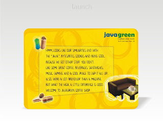
 This campaign was created for a coffee shop client. All the campaigns listed below are only scratch works/ concept cards.
 This is a campaign ideated and designed for a pitch work.
 A full length corporate campaign for an airline company signifying its special features.
A full length corporate campaign for an Hospitality group, playing upon its rich heritage.


Full length corporate campaign with teaser for an upcoming project of a realty client.
 Mother's day campaign for a coffee shop client.
Subscribe to:
Comments (Atom)


